

Typography makes up a larger part of your visual brand than you may realize. Just like color has meaning for your brand, typography is equally as powerful in representing the tone and values of your brand. A well-considered typographic palette helps to tie all communications together, from the copy on your website to your logo, printed materials, and more. While there are thousands of typefaces to choose from, there are two important categories you need to understand in order to make a grounded design decision: Serif and Sans Serif.
Serif
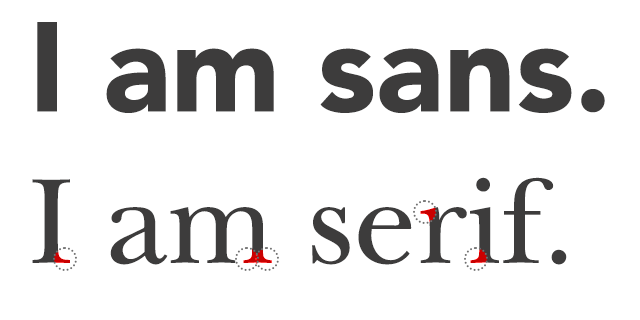
In typography, a serif is a small stroke or decorative line that extends from the stem of a letter. Thus, a typeface that has serifs is called a serif typeface. Serif typefaces have been widely used in traditional printed material such as books and newspapers. The thick and thin strokes that form a serif letter evolved from the pressure points created by a calligrapher’s hand. They are among some of the oldest modern typefaces, which is why they often get equated with tradition.
Given their lineage, serif fonts remind us of more classical, formal, and sophisticated themes. They work great for more traditional businesses such as law firms, financial services, banking institutions, or insurance companies. Some of the most well-known serif fonts include Times New Roman, Georgia, Baskerville, and Garamond.
Sans Serif
From the French word sans meaning “without”, sans serif typefaces are devoid of strokes that distinguish a serif typeface. Sans serif typefaces are made up of simple, clean lines that are the same width throughout. The crisp lines and sharp edges render out more clearly on a screen which increases legibility for users. For this reason, sans serif typefaces have emerged as a popular choice in the digital world.
Sans serif fonts communicate a youthful and modern quality. They are a great choice for businesses that want to appear innovative and cutting-edge. Some of the most well-known sans serif fonts included Arial, Helvetica, Open Sans, and Proxima Nova.
Choose a Typeface that Feels On-Brand
When it comes to choosing a typeface, serif or sans-serif, it’s important to keep in mind what you stand for as a brand. While serif typefaces tend to feel more traditional and sans serif typefaces are associated with being more modern, there are exceptions to the rule. The key is to understand why you’re using each one and what it will convey to your audience.