
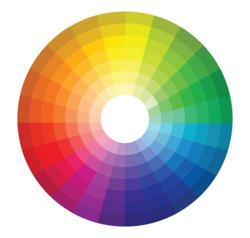
When it comes to branding, the power of color is profound. It evokes emotions and behavior. It has the ability to convey meanings and messages without words. Color makes up a large part of your brand’s visual identity, and can therefore greatly influence how your customers perceive and remember you. Each color has a different set of connotations and will create a different representation of who you are as a brand and what you stand for. Here, we’ll look at how each of the following colors affect us and what that means for your brand.
Red
Red carries different meanings and can be used in a variety of industries. It evokes emotions ranging from passion and desire to warning and danger. It signifies leadership qualities, and promotes ambition and determination. It is stimulating to the senses, excites our emotions, and motivates us to take action.
Yellow
Yellow is the color of sunshine. It is associated with happiness, optimism, energy, and intellect. Yellow stimulates mental activity, communicates joy, and increases enthusiasm. Yellow also helps to draw attention and can be used to highlight instruction and important information.

Green
Green has two very common meanings: nature and wealth. When it comes to nature, green represents growth, healing, harmony, freshness, and the environment. On the other hand, green is the color of money and is therefore associated with wealth, finance, and banking.

Blue
Blue has many versatile qualities. It is often used to convey trust, loyalty, knowledge, and authority. It induces tranquility and calmness as well as order and direction. It is conservative and reliable—a safe and non-threatening color.

Purple
Purple is traditionally associated with royalty. It is a sophisticated yet mysterious color. Due to its association with luxury and wealth, purple is often used to promote high-end products. In its lighter shades, such as lavender, it can be used to symbolize spring and romance.
Orange
Orange represents creativity, balance, warmth, and encouragement. In its muted forms, orange can be associated with autumn and earth. As a citrus color, it can be associated with health and vitality.
![]()
White
White is simple, pure, and clean. These three qualities make it a popular in the healthcare and cleaning industries. By tapping into its elegance and simplicity, it works great with high-tech products. In design, white is often used to convey a minimalist aesthetic and modern quality.

Black
Black symbolizes mystery, power, and elegance. It is both classic and sophisticated, and works perfect with luxury products. Black can be combined with every color from the wheel which makes it a popular color choice for a brand logo.

Choosing a color for your brand logo is an important decision. However, knowing about color psychology and how it shapes perception makes it easier to align your designs with your brand’s personality. Check out the recent work section on our website to see examples of how we’ve helped businesses develop their brands, visually.